
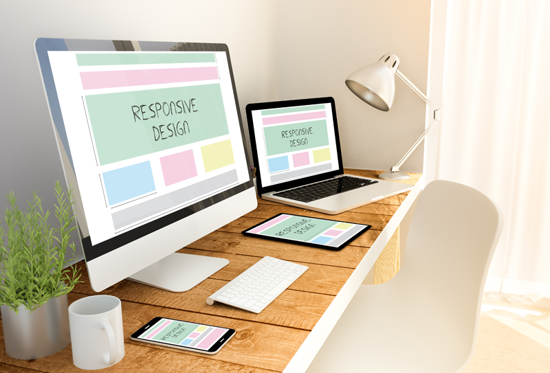
When new devices of varying screen crop up regularly it is essential that you have a web design that adapts itself to multiple screen sizes. If your website doesn’t do this correctly, it could put the viewer off and could potentially mean a customer going to another website or even a competitor. When you have a site with a responsive website design. It looks good on a smartphone, tablet, an e-reader or just a desktop. WSS Creative can create or revamp a new website design which is responsive across platforms including i-pads’s and mobile devices. Contact us today for a competitive quote.
Contact us


